Challenges
Before the redesign, the Serenity Aesthetics website had limitations that were holding back engagement and conversions:
-
Inconsistent visual branding: The design did not fully reflect the high-end, professional aesthetic clients expect.
-
Complex site structure: Information on services was spread out and hard to quickly understand.
-
Weak calls-to-action: Visitors weren’t consistently guided toward booking or consultation steps.
-
Limited social proof: There was minimal emphasis on testimonials, treatment results, or trust elements.
Our Solution
To meet Serenity Aesthetics’ goals, we developed a full website refresh focused on clarity, brand expression, and conversion strategy.
Brand Refresh & Visual Consistency
We created a refined, elegant visual style that aligned with the clinic’s premium identity:
-
Sophisticated color palette and typography matched to the Serenity brand
-
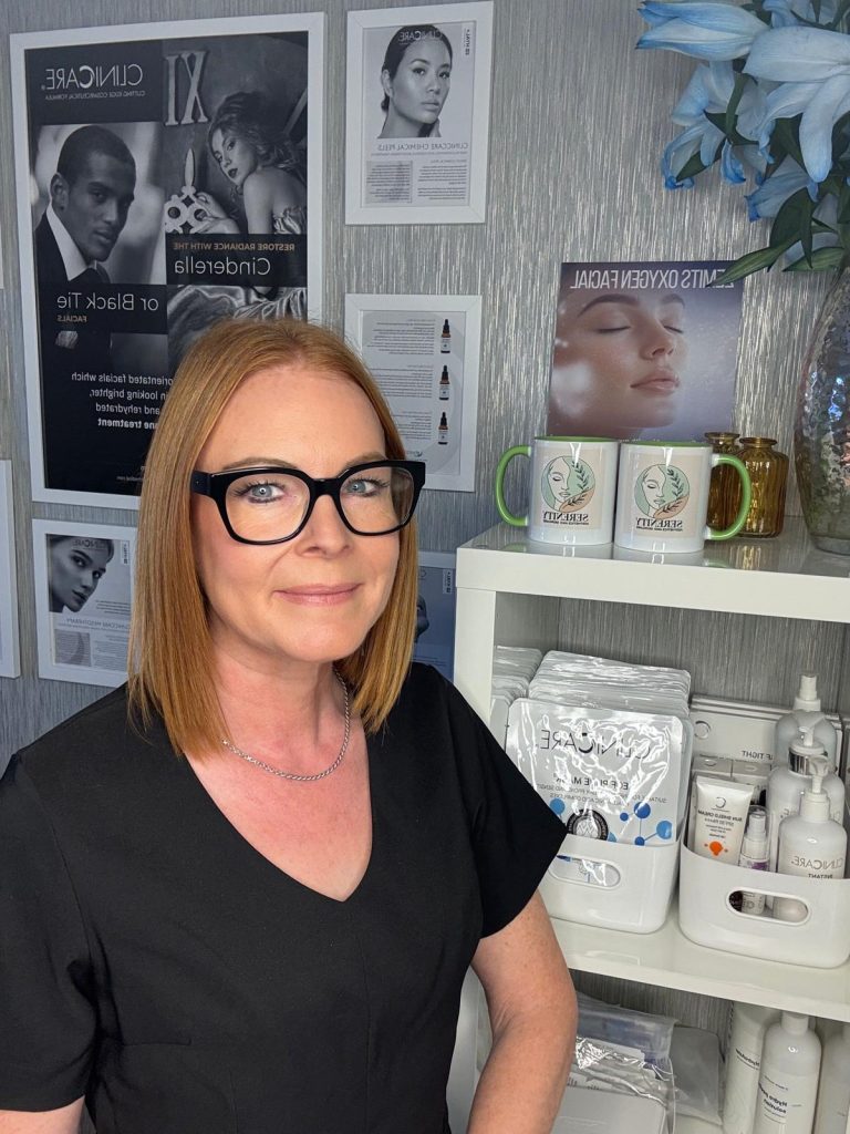
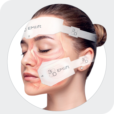
High-quality imagery showcasing real treatments and results
-
Stylish iconography and layout for a polished, modern feel
This elevated the overall user perception of the brand at first glance.
Messaging & Content Strategy
We rewrote key site content to communicate clearly and persuasively:
-
Benefits-focused descriptions for each treatment
-
Straightforward explanations of service outcomes
-
Language tailored to build comfort, trust, and confidence
This ensures each visitor immediately understands what Serenity Aesthetics offers and why it matters.
Improved Information Architecture
We restructured the site layout so users can:
-
Easily navigate by treatment category (face, body, skin, etc.)
-
View pricing and treatment goals without confusion
-
Quickly find consultation and booking information
-
Use sticky navigation menus that work intuitively
Engaging Conversion Paths
To increase bookings and leads:
-
Strategic placement of Book Now and Free Consultation CTAs
-
Integrated contact forms that reduce friction
-
Easy-to-find phone and booking links on every page
-
Testimonials and before-after galleries to elevate trust